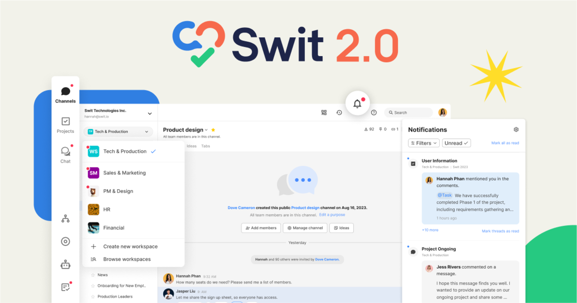
Upgrade Your Collaboration with Swit 2.0
How will our new features improve your productivity?
September 5, 2023
Since its creation, Swit has been a product that improves with and adapts to the changing needs of its users, and the latest effort in this endeavor is Swit 2.0.
With flexible pricing plans and true cross-workspace functionality, the new and improved Swit is the ideal Work OS for any and every business. Swit’s user interface is intuitive, sleek, and streamlined to provide the best user experience.
At a Glance: What’s New?
Our most-anticipated and significant update of the year provides you with an unparalleled collaboration experience like you’ve never experienced before.
Swit 2.0 brings the Organization and Workspace home pages together in one centralized hub, where Channels, Projects, and Plug-ins are incorporated seamlessly for unmatched ease of operability.
The update also enables a detailed view of task cards in the right panel, preventing unnecessary screen switching that can break your concentration. It makes multi-tasking a breeze when you can use a split screen to simultaneously view tasks and projects across workspaces.
Constant notifications can be a source of disruption and annoyance, which is why Swit 2.0 groups notifications from the same task card or event together, so your mentions are minimized and your focus is uninterrupted.
Mobile notifications now appear as a banner instead of a pop-up, so you can stay informed without interruptions to your workflow.
One Global Home
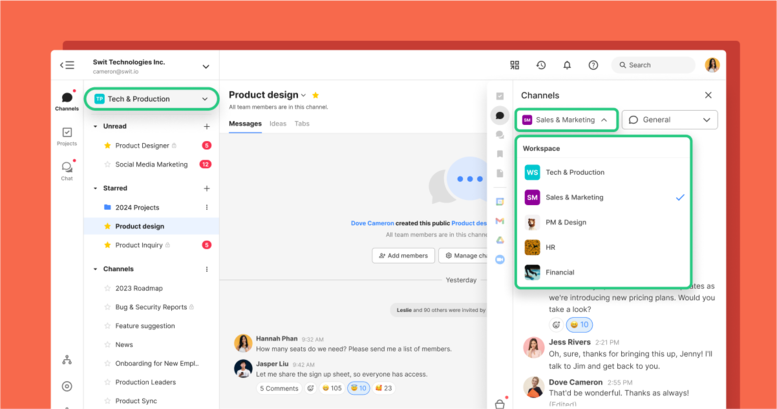
The integration of Organization Home and Workspace Home makes navigation and project management much smoother.
This seamless merger also increases flexibility and enables multitasking by allowing access to channels and projects across different workspaces.
Swit 2.0 promises unparalleled customization with several plans and plug-ins that can be configured to meet your company’s specific needs.
One Account, Multiple Organizations
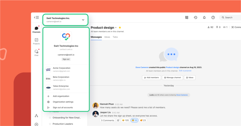
A single account and sign-in method gives you access to multiple organizations regardless of your plan tier. From one registered account you can easily toggle between workspaces for an improved user experience.
Channels
Desktop
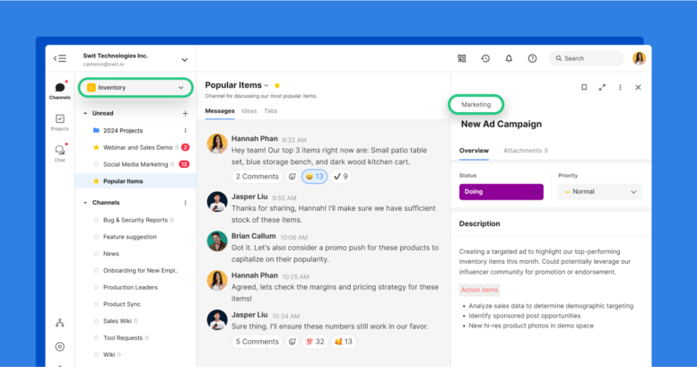
Running a business can involve needing to manage inventory, process payroll, plan sales and marketing initiatives, and a whole lot more. Using Swit as your Work OS, you’re able to set up separate workspaces for each of these departments.
For example, you could access the Popular Items channel in your Inventory workspace while simultaneously opening a New Ad Campaign task card from the Marketing workspace in the right panel. This allows for seamless multitasking without switching between workspaces.
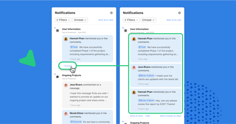
Swit 2.0 organizes notifications in threads and gives you the freedom to prioritize alerts from certain projects or channels using custom filters.
You can choose to view notifications from specific workspaces or plug-ins and determine what types of mentions to include.
We’ve renamed the Chat tab to Messages and changed its location so that it now appears alongside the Ideas tab. Our team put a lot of thought into all the changes made to the overall UI design to optimize it for usability, including the message input editor, header, and tabs.
Mobile
We have good news for those who use Swit on the go! With the Swit mobile app, you can now expand the input editor to full screen, making typing much more intuitive. The Ideas tab has also been moved next to the Messages tab, so switching between conversations is smooth and easy.
Access Chat across Workspaces
Direct Messages have been renamed to Chat and can now be accessed at a global level, across workspaces. Quick access to Chat is still available through the right panel, with the added option to view it full screen from the home menu.
Projects
Desktop
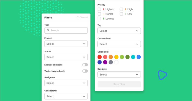
The search filter has been standardized in a unified menu, allowing you to search tasks based on Collaborators, Assignees, Priority, or Status.
This filter can be used across projects and workspaces to search through all tasks.
For example, you could use these filters to view all the tasks you’re assigned to that are high priority, or check to see which tasks your team has marked as completed.
The Kanban category has also been updated and offers view options based on Status, Bucket, and Assignee.
Task Details in Right Panel
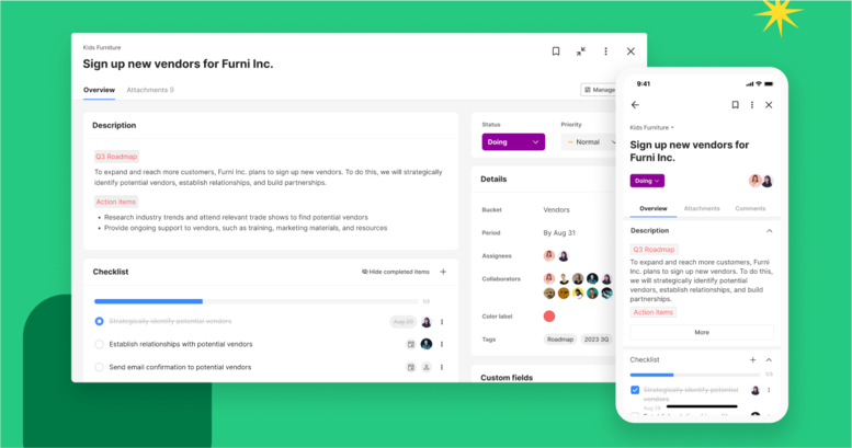
Clicking on a task card now opens a preview in the right panel, so you can multi-task with ease. You then have the option to expand the card to full screen as needed using a toggle on the top right of the task window.
Attachments to task cards can be found under a separate tab, allowing users to view content based on type, such as Messages, Goals, Files, or other essential information.
You can now attach up to 100 relevant items to a task card and link related task cards across workspaces and projects.
This is particularly useful for cross-departmental initiatives or large projects that require deliverables from several teams.
Threaded Notifications
Notifications from all your workspaces are now accessible in one place.
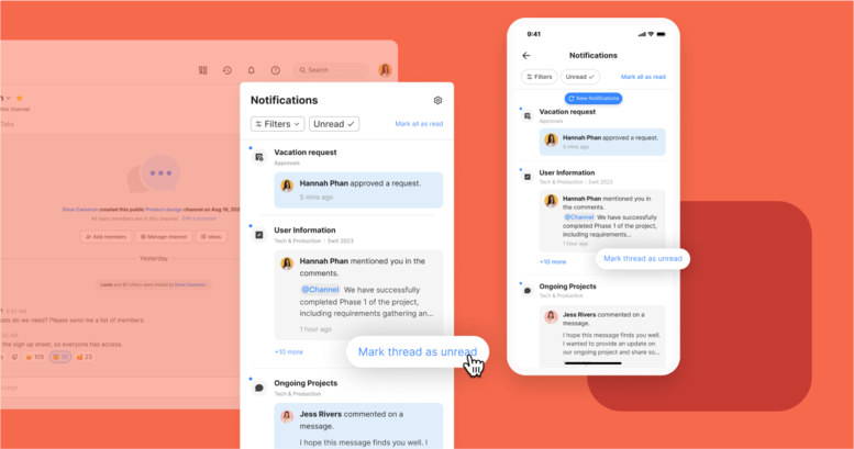
Notifications related to the same channel, project, or task card are grouped together in one thread, making it easier to stay updated.
You can choose to only view unread notifications, ensuring you never miss an important message. Swit 2.0 also gives you the option to mark items as unread as a way to bookmark them for reference.
In addition to all this, you can filter your notifications to only view what you need to see, such as emoji reactions, or to only view from certain locations, such as specific workspaces or plug-ins.
Files from Every Workspace
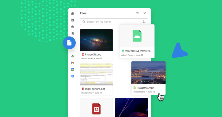
Files uploaded to channels, projects, and chats can now be shared across workspaces at an organizational level. You can also access the relevant file folder and simply drag and drop files into channels or chats.
The UI upgrade has also improved the image quality of file thumbnails, letting you preview the content without having to click and expand.
Saved Items from Every Workspace
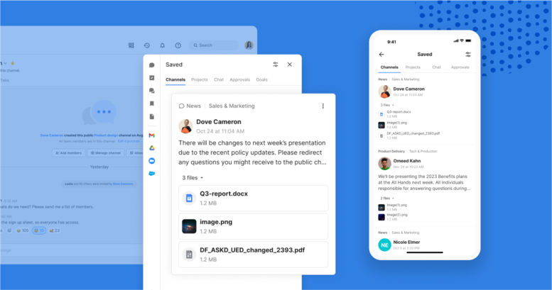
Starred and Bookmarked have now been combined under one tab known as Saved, which works on the organizational level, across workspaces.
Any items that are Saved can be accessed across workspaces and shared through drag-and-drop.
Employee Connection Where It Counts
Swit was first conceived as a solution to minimize the inefficiencies that stem from constantly switching between single-function work tools.
Swit 2.0 takes that mission a step further by also minimizing tab-switching within our own product to ensure that everyone in your organization is quite literally on the same page.
To achieve this, we didn't just make cosmetic changes to the UI. Our team was dedicated to ensuring the new version of Swit outperformed the previous version in every possible way.
We overhauled a lot of the inner workings that you never see, including user structure, system architecture, API schema, payment systems, and admin functionalities.
Though it was a challenging process, the system has become much lighter and more scalable. Our priority has always been an excellent user experience and seamless collaboration, and we’re confident you’ll find that in Swit 2.0.
Contact us to schedule a demo and see what makes Swit such a hit!
Nyda Ahmad, Copywriting Manager and Natalie Litofsky, Managing Editor