Introducing a New Look for Swit
Updated style and materials focus on employee connection and information accessibility
March 24, 2023
Swit was built to connect people in efficient and meaningful ways. Our platform began as a way to combine the most frequently-used work functions — chat and task — into a single app, minimizing the inefficiency that came from switching between single-function work tools. The Swit logo, branding, and website all centered on that core functionality and our founding philosophy, which led to a heavy emphasis on thought leadership and conceptual problem solving.
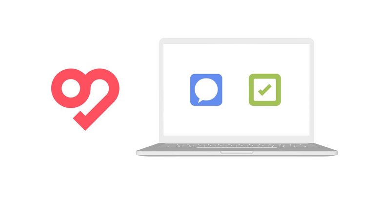
Within our product, these essential functions were represented by the colors green for task management, and blue for communication. Our logo, on the other hand, was a red heart — shaped in a way to represent connection, communication, and work. Since then, Swit has expanded beyond just chat and task to become a true work hub that brings an entire company together by centralizing everything needed for both work and organizational management.
As Swit continued to grow, this presented two issues: one, was that the colors of the product and the brand identity were not aligned — along with concerns that a red heart could be confused for a dating app — and, two, was that Swit had evolved as a product to offer even more comprehensive work management solutions.
We needed to rethink the logo and web content to better align our product and brand identity, while also reflecting our product’s evolution and providing more in-depth information to current and prospective users.
Logo and Brand Identity
Early explorations
Initially, we focused on ways to use our product colors in the heart logomark through solid-color patchworks or a single blue-to-green gradient. We also considered abandoning the heart shape in favor of an “S” shape or other symbols.
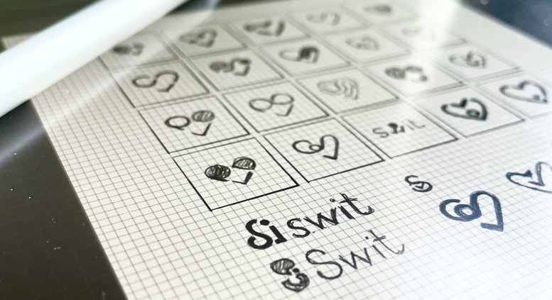
Ultimately, we chose to keep the heart. For us, the heart represents relationships: Swit helps bring employees together and fosters a sense of belonging in remote and hybrid office environments.

Our new icon
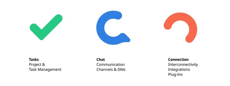
The new Swit heart uses rounded corners to make it more approachable. It appears in three segments, representing Tasks, Chat, and Connection.
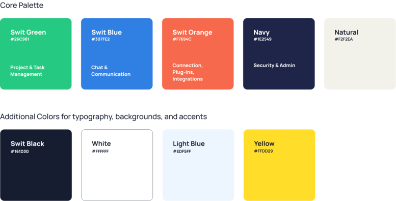
Our logo colors align our identity with our product and reflect a third feature through the addition of Swit Orange — an energetic and cheerful shade representing connection through interconnectivity, integrations, and plug-ins.
Structure and storytelling
Our core color palette is made up of our logo colors, a dark Navy blue, and a soft “Natural”: the framework for our brand and storytelling across all of our visuals. This allows us to communicate our features and benefits through visual cues.
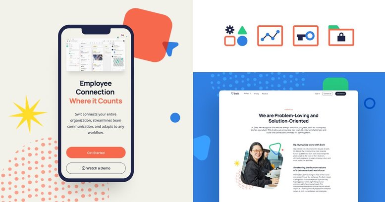
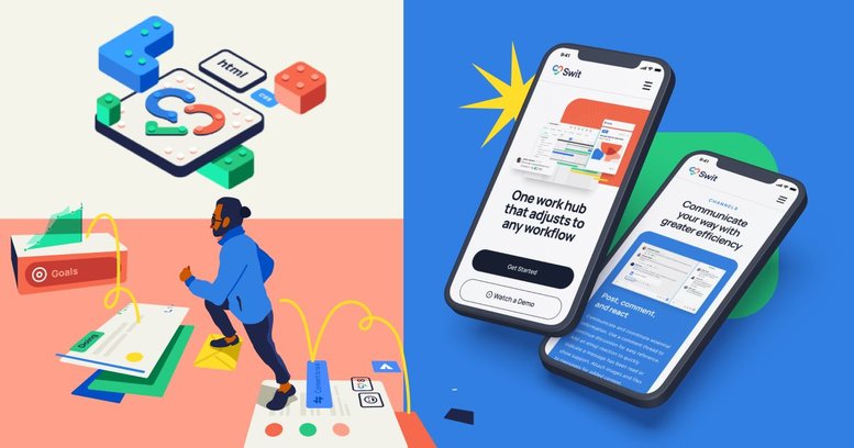
This new visual language includes a collection of shapes that can be combined to show work processes, flexibility, and customization — the unique ways individuals and teams work together towards shared goals. The shapes can appear in both solid and outline form, and can overlap to suggest transparency and cross-workspace collaboration. Rounded corners help to humanize the shapes, and curved, fluid lines express an unhindered flow of ideas and information.

Applying the brand
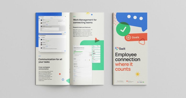
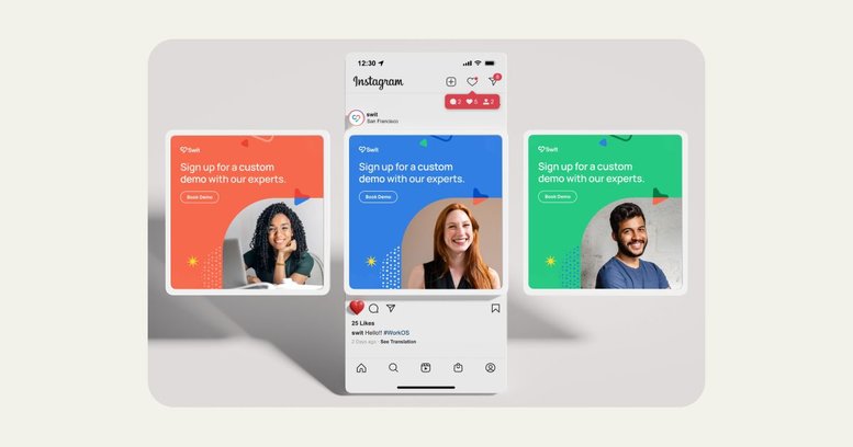
These core design components allow us to express our product features, brand identity, and value propositions for a variety of uses. They can be used prominently to visualize a feature or process, or play the supporting role for photography, illustration, and our product images.
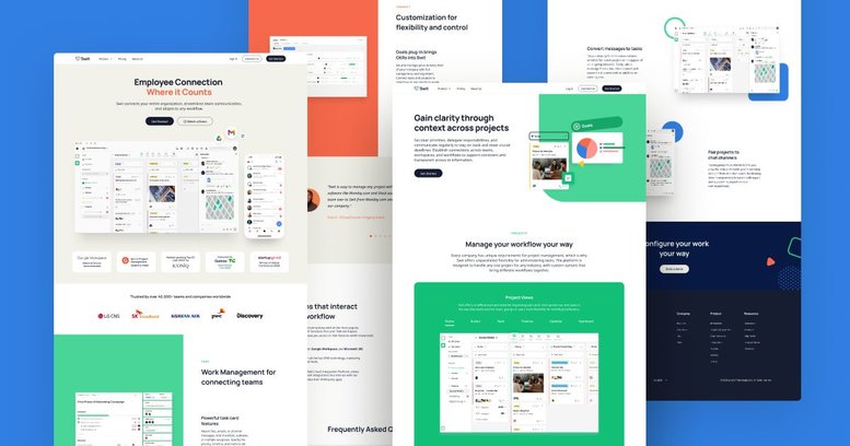
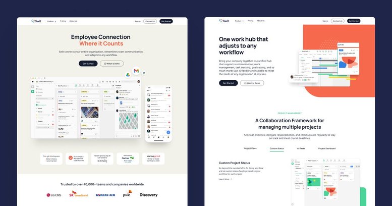
Our new website was designed to show our product through real-world examples with the support of our new color system and a subtle use of graphic elements. Our illustrations present human elements and our product in harmony.
Website Content
Research and feedback
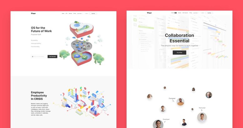
We began the process of refreshing the website by creating an in-depth questionnaire for all Swit employees in every department. Our goal was to gather as much feedback as possible about our website and to get a better understanding of how people viewed our product and our brand. We encouraged everyone to be brutally honest, because we knew their criticism would be just as important as their praise in determining our next steps.
Writing with purpose
After analyzing all the responses we received, we were able to draft a plan for new website content that would better define the features and benefits of Swit.
Simple and straightforward
Our content would use clear and plain language to describe the product and its functionality. This would also be reflected in sample content presented in sample UI images and videos.
Present solutions to universal problems
In our writing, we would avoid overly philosophical language or industry jargon. The text would be designed to be easily absorbed by all readers and show how Swit could be used by any industry.
Connect with potential customers
The site would be designed to better highlight testimonials, user reviews, and industry awards. We would also make it easier to request a demo or test the product using a revamped simulator.
Perfecting the messaging
With a roadmap in place for what information we wanted to share and the tone set for how we would convey it, our content team collaborated cross-functionally with coworkers in design, sales, marketing, product, and strategy roles to make sure that every stakeholder had input into how the finished site was put together.
We went through multiple iterations of every page until we found the right balance of showing and telling for each Swit product function.
At Swit, we recognize that we are always a work in progress, both as a company and as a product. This is why we encourage our team to embrace challenges and build the connections needed for solving them.
Creating a new visual brand identity and website is no simple task. It requires in-depth exploration, cross-team coordination, and constant communication, plus the management of multiple projects and tasks. This is further complicated when teams and team members are located in different cities and time zones around the globe, working both in the office and remotely.
Fortunately for us, Swit is designed for the type of cross-functional collaboration that projects like this require. Contact us to learn more about how our collaboration hub can support the workflow for your next project.
Check out the new Swit website and follow us on LinkedIn, Facebook, Instagram, and Twitter to see our new branding in action.
Garrick Antikajian, Lead of Design and Natalie Litofsky, Managing Editor